Dial-A-Cluster Model
The Dial-A-Cluster (DAC) model allows interactive visualization of multivariate time series data. A multivariate time series dataset consists of an ensemble of data points, where each data point consists of a set of time series curves. The example of a DAC dataset used in this guide is a collection of 100 cities in the United States, where each city collects a year’s worth of weather data, including daily temperature, humidity, and wind speed measurements.
In the DAC model, the data points are displayed using a two-dimensional scatter plot. Each data point, e.g. city, is represented as a point in the scatter plot. Interpoint distances encode similarity so that, for example, two cities are near each other if they have similar weather throughout the year. Further, DAC provides sliders that allow the user to change the relative influence of the temporal variables on the scatter plot. These changes are computed in real time so that users can see how different time series variables affect the relative similarity of different data points in the ensemble – hence the name Dial-A-Cluster.
DAC computations are performed using a weighted sum of time series distance matrices to produce a visualization via the classical multidimensional scaling (MDS) algorithm [1]. In addition to ensemble visualization, DAC provides comparisons between user selected groups in the ensemble as well as the influence of any available metadata.
DAC was developed independently outside of the Slycat™ project using Slycat’s plugin architecture. Consequently, many of the user interface and representational conventions used in other Slycat™ models are missing or different in DAC. Although DAC operates on ensemble data (where an ensemble is a set of related samples defined using a set of shared variables), there is no concept of input or output variables as in other Slycat™ models, only a table of scalar metadata and multiple time-varying data sets for each ensemble member.
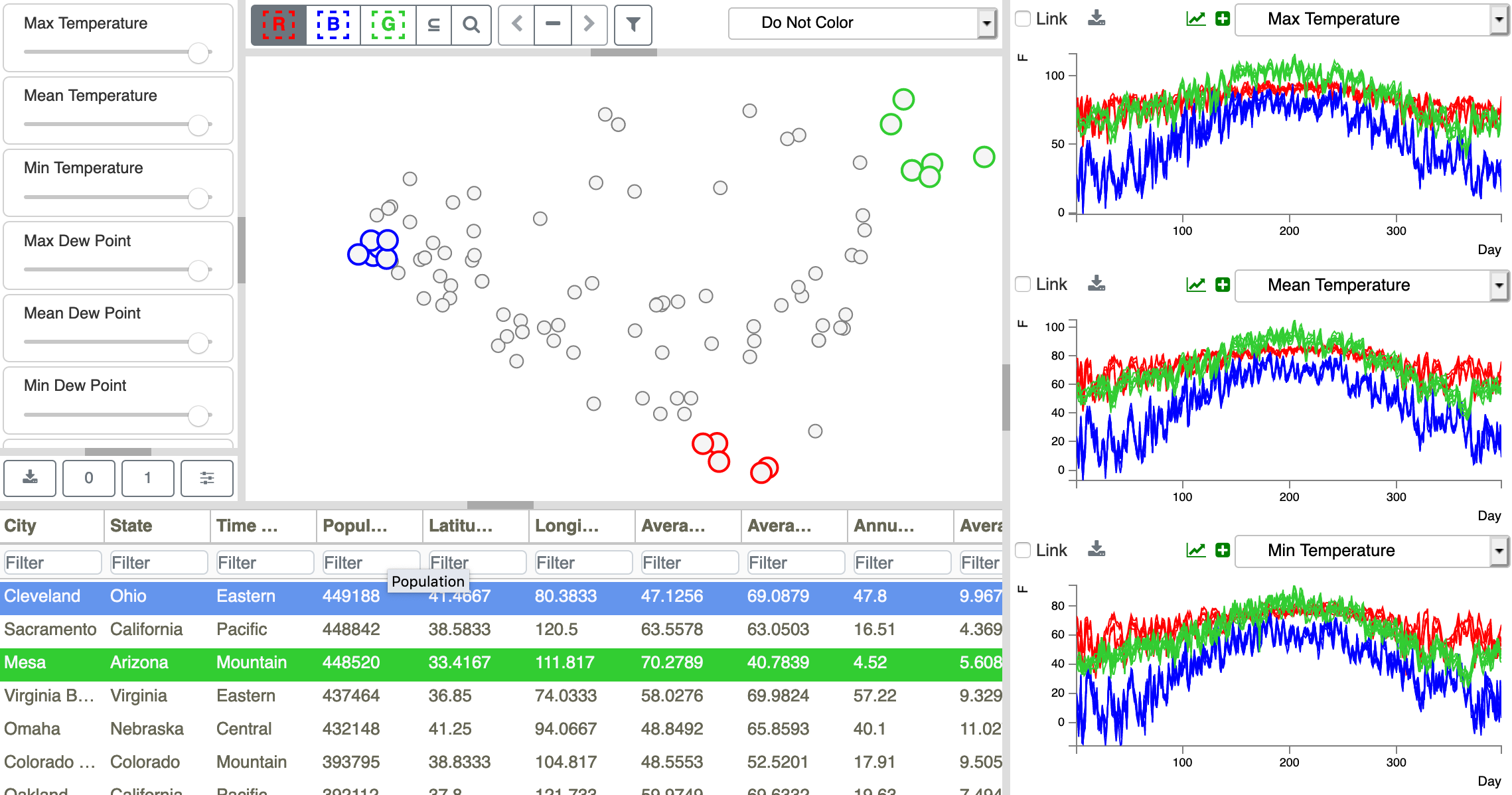
Figure 1: DAC user interface consisting of four linked views. In clockwise order, starting from the upper left corner, there is (1) a panel of sliders for adjusting temporal variable weights, (2) a scatterplot with a point per ensemble member, in which point proximity indicates member similarity, (3) time series plots for three temporal variables contrasting selected groups (red/blue/green sets) of ensemble members, and (4) a table of scalar and text metadata for each ensemble member (row).
The DAC model consists of four linked views, as shown in Figure 1: (1) a Slider panel (left view) for adjusting the importance of each temporal variable in the similarity calculation; (2) a Scatterplot (center top view) showing similarities between ensemble members; (3) Time Series Plots (right view) for comparing three sets of selected ensemble members, with sets shown in red, blue, and green; (4) and a Metadata Table (bottom left view) displaying values from shared scalar variables (columns) for individual ensemble members (rows).
Footnotes