Model Views
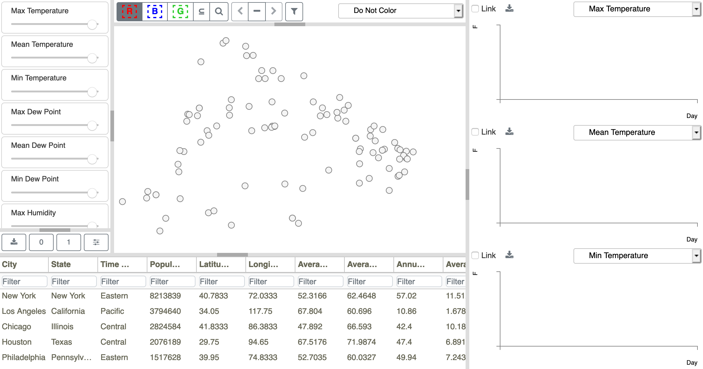
Figure 14: Initial DAC model configuration for the Weather Data.
There are multiple linked views in a DAC model, including a Scatterplot (top middle), a set of Sliders (upper left), three Time Series Plots (right side), and the Metadata Table (bottom left). The Scatterplot is the central view and it represents each ensemble member as a point. Point positions are calculated using multi-dimensional scaling (MDS) based on a weighted sum of temporal variable distances between members. Note that MDS is calculated using just the set of temporal variables shown as sliders on the left (i.e. none of the Metadata Table variables are involved). The Sliders provide interactive control of the summation weights, so you can explore the impact that different variables have in Scatterplot point clustering. Points can be selected in the Scatterplot or Metadata Table views to define up to three sets (where each set of points is color-coded with red, blue, or green borders). These sets are used to compare time series data from the selected points in the Time Series Plot views. Additionally, the interiors of the Scatterplot points can be independently color-coded by any of the scalar variables shown in the Metadata Table. Initially, points are not color-coded (drawn with white interiors) and do not belong to any set (drawn with black borders), as shown in Figure 14.