Automatic Scaling
The auto-scale button  (to the right of Media Set) enables/disables automatic scaling of the scatterplot
axes when points are hidden or filtered out (these two mechanisms are mutually exclusive, see Selection Action and
Filtering). As points are removed, the locations of the remaining points shift to span the available space and the axes
are redrawn to reflect the reduced value range. The mapping between point colors and the values shown in the legend is also
modified to reflect the reduced value range (i.e. the new maximum value is now mapped to the brightest red and the new
minimum value maps to the deepest blue, maximizing the color distinctions between the remaining points). Compare the
scatterplots in Figure 40 and Figure 41 to see the effects of using auto-scaling.
(to the right of Media Set) enables/disables automatic scaling of the scatterplot
axes when points are hidden or filtered out (these two mechanisms are mutually exclusive, see Selection Action and
Filtering). As points are removed, the locations of the remaining points shift to span the available space and the axes
are redrawn to reflect the reduced value range. The mapping between point colors and the values shown in the legend is also
modified to reflect the reduced value range (i.e. the new maximum value is now mapped to the brightest red and the new
minimum value maps to the deepest blue, maximizing the color distinctions between the remaining points). Compare the
scatterplots in Figure 40 and Figure 41 to see the effects of using auto-scaling.
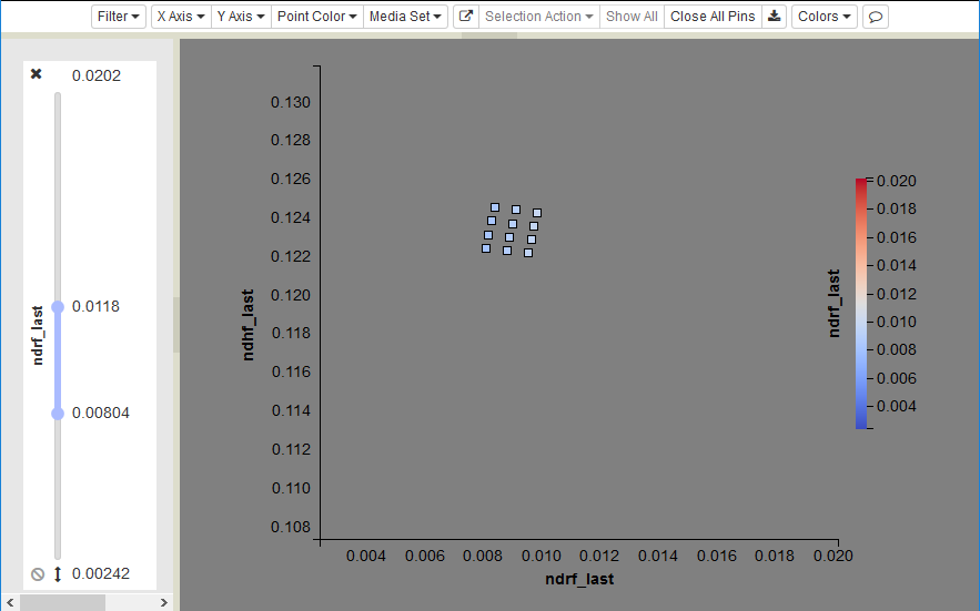
Figure 40: Filtered scatterplot with auto-scaling off. Note that most of the scatterplot is empty.
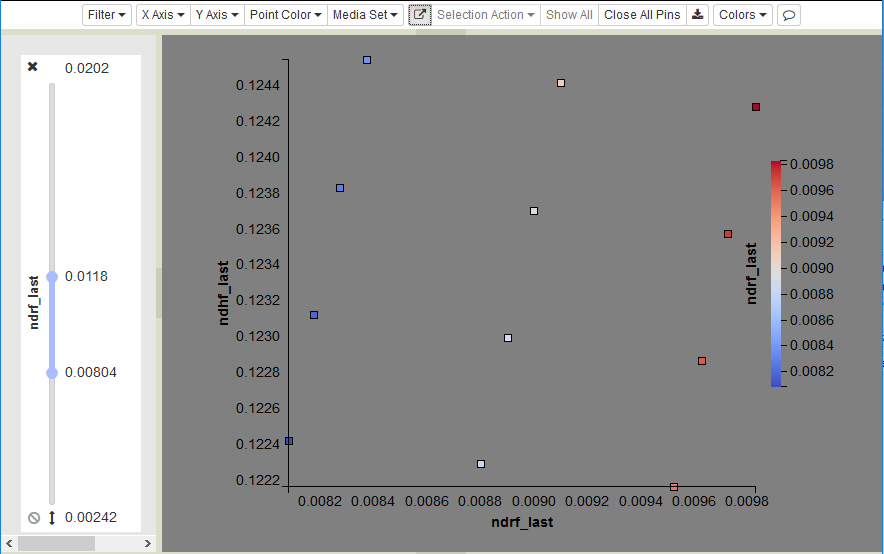
Figure 41: The same filtered scatterplot with auto-scaling enabled. The color range is scaled as well.
This feature is especially useful if a variable’s value range is skewed by a few anomalous points. For example, imagine a data set where most points have x-coordinates in the range from 0 to 1, but a few points have extreme values of 10,000. Including the extreme points means that most of the plot consists of empty space, while the majority of points are drawn on top of one another near the origin. By filtering and rescaling, you can remove the extreme points and have the remaining points fill the plot. Note that automatic scaling is enabled as the default, indicated by the darkened state of the button (Figure 41).