Correlation View
The Correlation View displays the relationships found between variables when the ensemble is viewed holistically. Each column of the Correlation View’s bar chart represents a different canonical component. These orthogonal components are ordered from left to right in decreasing importance, as shown by the decreasing R2 and increasing p-values in the first two rows of each component column. Variable names are shown along the left edge with rows for input variables colored in green, and rows for output variables colored in lavender. The number of components returned by CCA is equal to the minimum of the number of inputs versus the number of outputs. So, for the example in Figure 23, where there are four inputs and three outputs, CCA will return three canonical components.
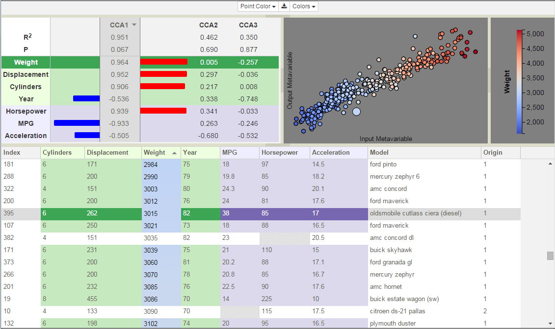
Figure 23: CCA model of cars data set displaying the first canonical component.
In the bar chart, only one canonical component is expanded at a time (e.g. in Figure 23, CCA1 is expanded, while in Figure 24, CCA1 is collapsed and CCA2 is expanded). Clicking on a CCA column name changes the selected canonical component. This collapses the bar chart from the previously selected component and expands that of the new component.
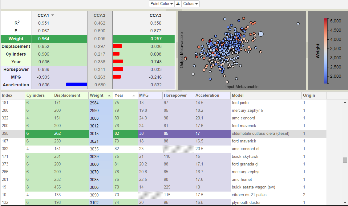
Figure 24: CCA model of Cars data set displaying the second canonical component.
The horizontal bars in the expanded bar chart visually encode the relationships between variables, both in terms of the magnitude of the structure coefficients, and in terms of the correlation type (positive or negative). Numeric values for the coefficients are displayed in the center of each column. Positive values are drawn as red bars extending towards the right. Negative values are drawn in blue extending to the left. The orientation combined with the color-coding acts to visually reinforce the relationship information. At a glance, you can see correlative relationships between variables and their strength by comparing the color, direction, and length of the bars. Positively correlated variables will display the same color and bar orientation, while negatively correlated variables will be opposed.
The bar chart rows can be sorted by variable strength. To the right of the CCA column name is a small triangular icon. Clicking on this icon sorts the columns by the unsigned magnitudes of the structure coefficients in the expanded column, though all columns will reflect the order returned by this sorting operation (i.e. the rows are sorted using this column as the key). The initial sort is descending and the orientation of the triangle reflects this by rendering the triangle with the wide edge at the top and the point at the bottom (e.g. CCA1 in Figure 23). The sorting order is reversed if you click the triangle again. Ascending sorts are signified by rendering the triangle with the point at the top. Inputs and outputs are sorted independently. For long lists of variables, the input and output variable sets are independently scrollable. Note that in Figure 24, although CCA2 is selected, the decreasing sort order from CCA1 is still maintained. Sorting column is independent of component selection. Hovering over any of the CCA column headers, the sorting icon for that column becomes visible and can be clicked without needing to expand the component.
Clicking on a row in the bar chart selects that variable for color-coding the points in the Simulation View (i.e. each simulation point is color-coded according to its value for that variable). The variable row is highlighted by darkening the background color and changing the font color to white. The color palette, shown in the Legend alongside the value range for the color-coding variable, corresponds to the currently selected theme (see Color Themes). This same color-coding is applied to the cell backgrounds of this column of the Variable Table, as is demonstrated by the Weight column in both Figure 23 and Figure 24.