Simulation View
The Simulation View is a scatterplot, in which each point represents an ensemble member. The axes of the scatterplot are the canonical variables, aTX and bTY, which are labeled as Input Metavariable and Output Metavariable. The x and y coordinates of each point are weighted sums of that point’s input and output variable values, respectively. Because the values of the canonical variables differ for each canonical component, changing the selected component in the Correlation View changes the point coordinates, which are then re-rendered in the scatterplot. Comparing the scatterplots in Figure 23 and Figure 24, you can see how the point locations shift from a loose diagonal for CCA1, to a ball of points for CCA2. Given the low R2 and high p-value for CCA2, the scatterplot point placement visually reveals the poor quality of the result (all points would be on the diagonal in an ideal result).
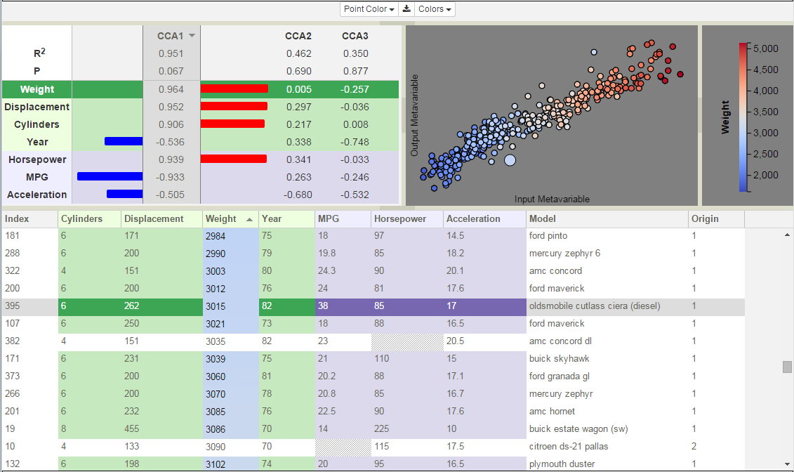
Figure 23: CCA model of cars data set displaying the first canonical component.
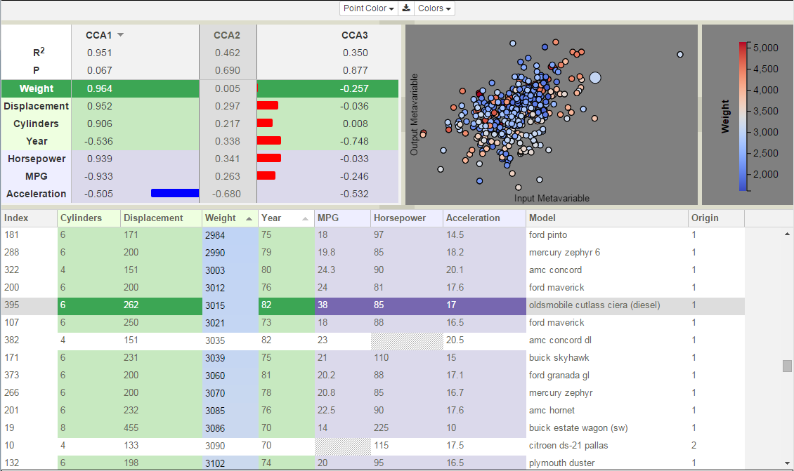
Figure 24: CCA model of Cars data set displaying the second canonical component.
Legend
To the right of the scatterplot is the Legend. The Legend is in its own view, which can be resized or closed altogether. The Legend displays information about the current color-coding variable, including its name, range of values, and the mapping between values and colors. The color palette is defined by the current theme (see Color Themes).
Color-Coding Points
The first time a model is rendered, the points are colored by their index number. There are three mechanisms for changing the variable that is used to do the color-coding: clicking on a variable in the Correlation View, clicking on the column header in the Variable Table, or selecting a variable from the Point Color dropdown list. Irrespective of the interface used, changing the variable selected for color mapping will lead to changes in all three views and the legend, including: highlighting the newly selected variable’s row in the bar chart, recoloring the scatterplot using the new variable’s values, coloring the cell backgrounds in its table column, returning the cell backgrounds of the previously selected variable’s column to its default color (green, lavender, or white depending on its type), and relabeling and redefining the value range in the Legend. Note that the table may include variables that are not present in the Correlation View, columns that are neither inputs nor outputs. These columns are drawn on the right end of the table against white backgrounds. These provide additional color-coding options (numeric variables only), however, the bar chart will not be highlighted because it only includes variables passed to CCA.
Selecting Points
Points in the scatterplot may be selected through several mechanisms. The simplest is to place the mouse cursor over a point and click the left mouse button. The selected point is redrawn in the plot with a larger radius, while simultaneously in the Variable Table, the row corresponding to the selected point is darkened and scrolled to be visible.
For groups of adjacent points that lie within a rectangular region, rubber banding can be used to draw a rectangle around the desired point set. Position the mouse at one corner of the region. Press the left mouse button down while simultaneously moving the mouse towards the opposite corner of the region. A yellow rectangle will be drawn between the location of the initial button-press and the mouse’s current position. Move the mouse until the rectangle encloses all the desired points, then release the mouse button to finish the selection.
Holding the control-key while selecting new points, either through clicking or rubber banding, will add these additional points to the previously selected set. Alternately, scatterplot points can be selected by picking rows in the Variable Table (see Simulation Selection).
Clicking in the background (not on any point) deselects all previously selected points.