Sparklines
To the right of the subtree icons and leaf nodes are small graphs, called sparklines [1], providing a high-level representation of the general shape characteristics of the associated node/subtree. For a node, its sparkline is its time series plot rendered into a thumbnail image. For a subtree, its sparkline is the sparkline of the node closest to the centroid of the group in the subtree.
Sparklines for subtrees are drawn in black. Sparklines for leaf nodes are color-coded to match the line color of the corresponding run in the Simulation View, and the cell color of the corresponding simulation in the Variable Table. Beyond color-coding being linked between all three views, selection is also linked. Selection of a line (or lines) in the Simulation View or Variable View will highlight (darken) the sparklines of the associated subtrees and/or nodes to reveal their location within the hierarchy, as shown in Figure 64. Alternatively, clicking on a sparkline performs a group operation that selects the associated node set, highlighting the corresponding lines in the Simulation View, and the corresponding rows in the Variable Table. Figure 65 shows how clicking the sparkline for the 8 node subtree results in highlighting the eight associated lines and rows in the other two views.
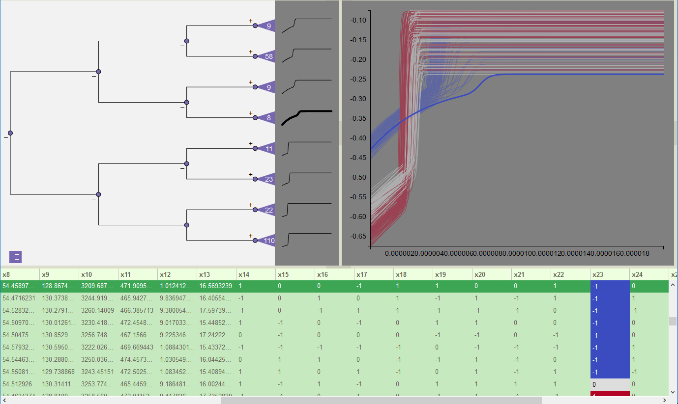
Figure 64: Sparkline highlights corresponding subtree for selected line in Simulation View,
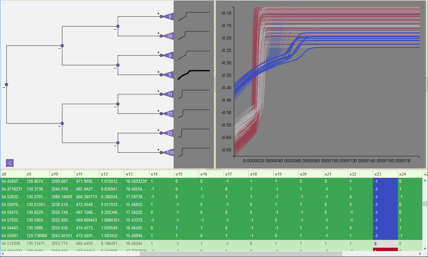
Figure 65: Clicking the sparkline for the 8-node subtree highlights the corresponding set of lines and table rows.
Highlighting and visibility are independent functions that may be combined. For example, in Figure 66, the set of runs that failed to peak are selected in the dendrogram. Highlighting is used to distinguish the runs in the subtree with 8 nodes from the subtree with 9 nodes. The 8 node subtree consists of runs that took longer to rise and had lower overall values than the 9 node group. Note that these differences are visible even in the sparklines for each subtree.
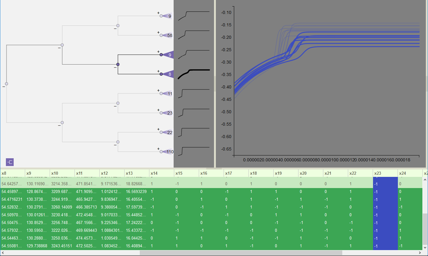
Figure 66: Select visibility combined with highlighting to explore differences in the set of runs that did not peak.