Metadata Color-Coding
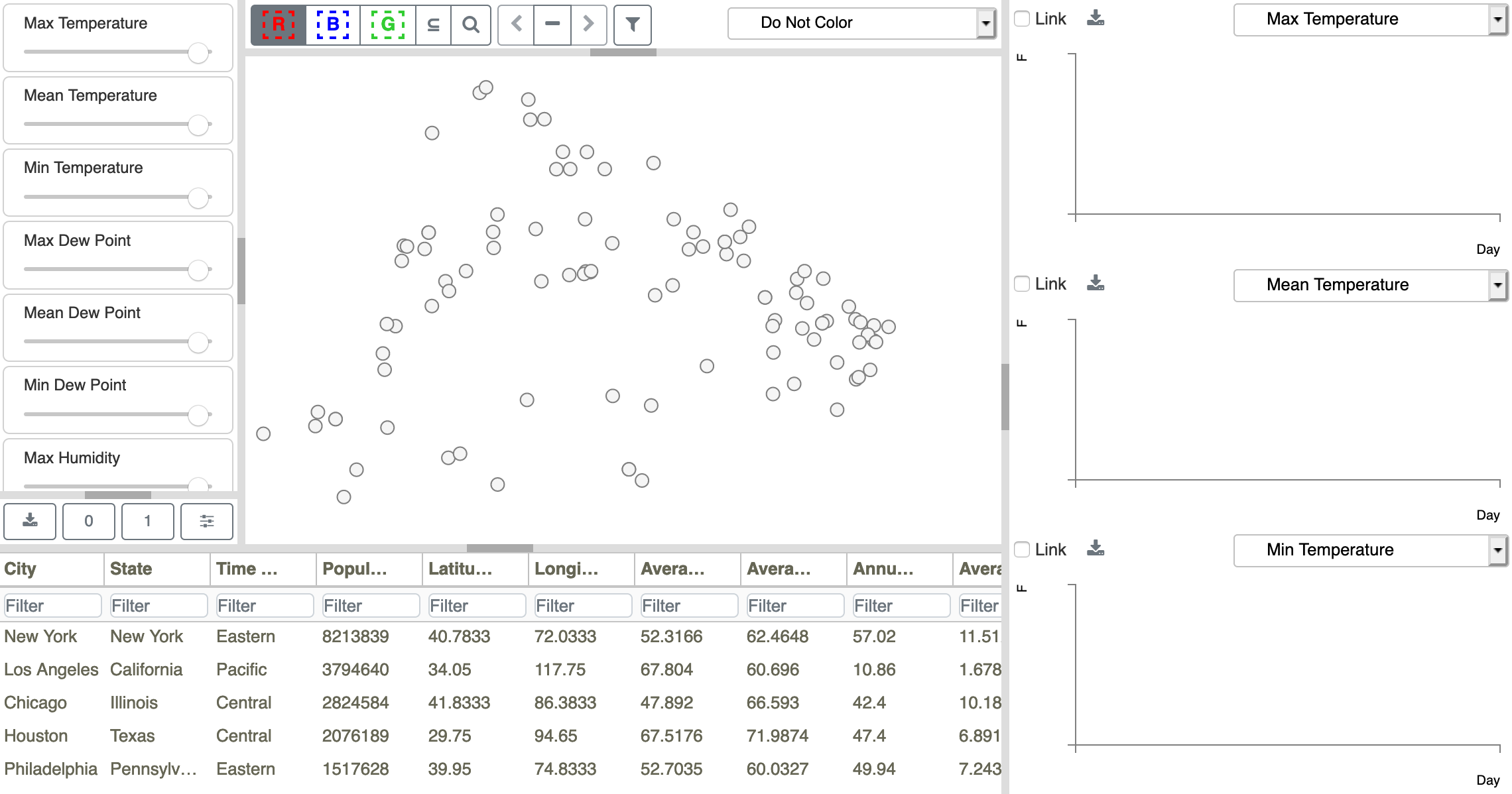
Figure 14: Initial DAC model configuration for the Weather Data.
In addition to seeing spatial patterns through point positions, you can color-code the points by variable values from the Metadata Table to reveal patterns across the points. By default, the initial view is not color-coded, as shown in Figure 14, where Do Not Color is shown as the point coloring selection in the upper right corner of the Scatterplot. Clicking on the Do Not Color button opens a dropdown list of Metadata Table columns, as shown in Figure 20. The list can be used to select the column values to be used for coloring. The current selection is always shown in the field at the top and highlighted in the list.
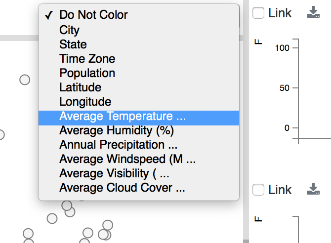
Figure 20: Weather data scalar variables for color-coding Scatterplot points. The default is ‘Do Not Color’.
After changing the variable to Average Temperature, the Scatterplot is recolored using shades of gray (see Model Preferences to change color palettes), where cities with higher average temperature values are colored darker gray and cities with lower values are drawn in lighter gray, as shown in Figure 23. Notice that although the MDS projection positions cities with similar values near one another, the highest and lowest values are not found on the extreme edges of the plot, since the projection is based on multiple temporal variables. Honolulu (outlined in red) and Anchorage (outlined in blue) are the points with the highest and lowest average temperatures, respectively.

Figure 23: Scatterplot after resetting the color-coding selection to Average Temperature. Honolulu is shown outlined in red, and Anchorage is shown outlined in blue.