Selecting Point Sets 
Thus far, we have explored similarities between ensemble members through their proximity in the abstract space of the Scatterplot. However, exploring and comparing temporally changing variables requires comparison of the underlying time series data. DAC does this for small sets of points using plots showing variable values over time to reveal temporal patterns.
Using the Scatterplot, we identify potentially interesting sets of points to view as Time Series Plots. Up to three sets of points can be defined at one time. The points of each set are rendered with color-coded borders (red, blue, and green). Points retain their fill color, which encodes a point’s value for the selected metavariable (see the previous section, Metadata Color-Coding).

Figure 24: Scatterplot control bar configured to select ensemble members for the red set.
To select points for the red selection, click on the  icon, as shown in Figure 24, then select a group of points.
This places them in the red group. Clicking on the
icon, as shown in Figure 24, then select a group of points.
This places them in the red group. Clicking on the  icon (as shown in Figure 25) places subsequently selected
points into the blue group. Similarly, points can be selected for the green group (as in Figure 26). Selection actions
operate only on the group indicated by the currently highlighted (gray background) color set icon. Points can be added to
a set through either a click-and-drag rubber-band operation to encircle points, or through individual point selection. Although
the initial point can simply be clicked on, adding additional points requires holding down the shift-key or the control-key
while clicking or rubber-banding each new point (simply clicking on additional points will not add them to the set). Clicking
on the background will clear the current point set. You can remove subsets of points by either shift- or control-clicking a
previously selected point, or by holding the shift- or control-key while rubber-banding a subset of previously selected points.
icon (as shown in Figure 25) places subsequently selected
points into the blue group. Similarly, points can be selected for the green group (as in Figure 26). Selection actions
operate only on the group indicated by the currently highlighted (gray background) color set icon. Points can be added to
a set through either a click-and-drag rubber-band operation to encircle points, or through individual point selection. Although
the initial point can simply be clicked on, adding additional points requires holding down the shift-key or the control-key
while clicking or rubber-banding each new point (simply clicking on additional points will not add them to the set). Clicking
on the background will clear the current point set. You can remove subsets of points by either shift- or control-clicking a
previously selected point, or by holding the shift- or control-key while rubber-banding a subset of previously selected points.

Figure 25: Scatterplot control bar configured to select ensemble members for the blue set.
Selections in the Scatterplot are linked to both the Time Series Plots (right view) and the Metadata Table (bottom left view), as shown in Figure 26. Plots for the selected points are drawn as correspondingly colored lines, while the selected table rows are highlighted with matching color-coded backgrounds. Since the links between the Scatterplot and the Metadata Table are bidirectional, selections can also be made by selecting rows in the table (see Table Row Selection).
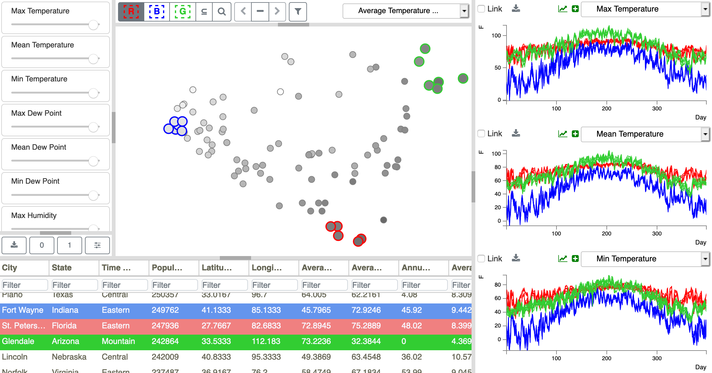
Figure 26: Cities near the extremes of the scatterplot are selected as R, B, and G sets. Looking at the Metadata Table, we see that the green group consists of hot dry cities, the red group as warm humid cities, and the blue group as colder cities. Selections are linked between the Scatterplot, Time Series Plots, and Metadata Table views.
The layout of the points in the Scatterplot appears to place hot dry cities in the top right corner, warm humid cities at the bottom, and cold wet cities on the left. Selecting points from each of these groups as our color-coded sets, we can explore this hypothesis by identifying the cities in each of the selected sets by scrolling through the Metadata Table, as shown in Figure 26. Indeed, the cities in green are in Arizona, the cities in red are in Hawaii and Florida, and the cities in blue are in New York and the Midwest.