Point Focus Selection
Sometimes it is useful to be able to distinguish one point within a designated set. This is known as focus selection. Clicking one of the previously selected points from within a set will cause that point and its corresponding representations in all views to be highlighted in black. The point is redrawn with a bolded black outline, the corresponding line is drawn in black in all three plots, and the background of the point’s corresponding row in the table is rendered in black. Selecting the point for the city of Chandler from the green set in Figure 26, produces the black highlights shown in Figure 27. This black highlighting feature is limited to a single point at a time. Focus selection operates as a toggle switch. Clicking on the point again will remove the black highlighting. Clicking on different point (within the colored sets) will shift the black highlight to that new point.
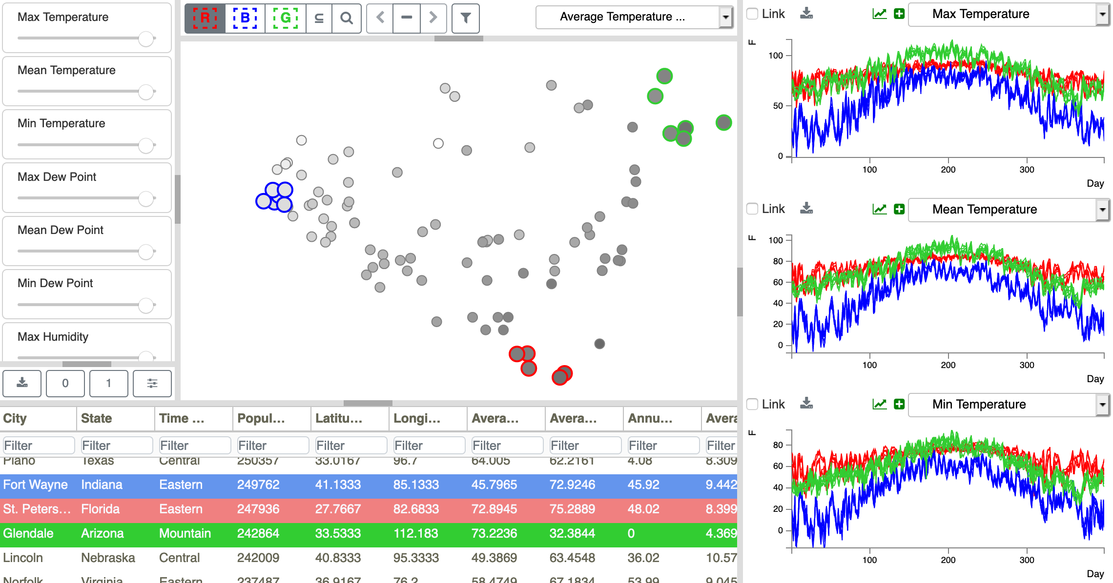
Figure 26: Cities near the extremes of the scatterplot are selected as R, B, and G sets. Looking at the Metadata Table, we see that the green group consists of hot dry cities, the red group as warm humid cities, and the blue group as colder cities. Selections are linked between the Scatterplot, Time Series Plots, and Metadata Table views.
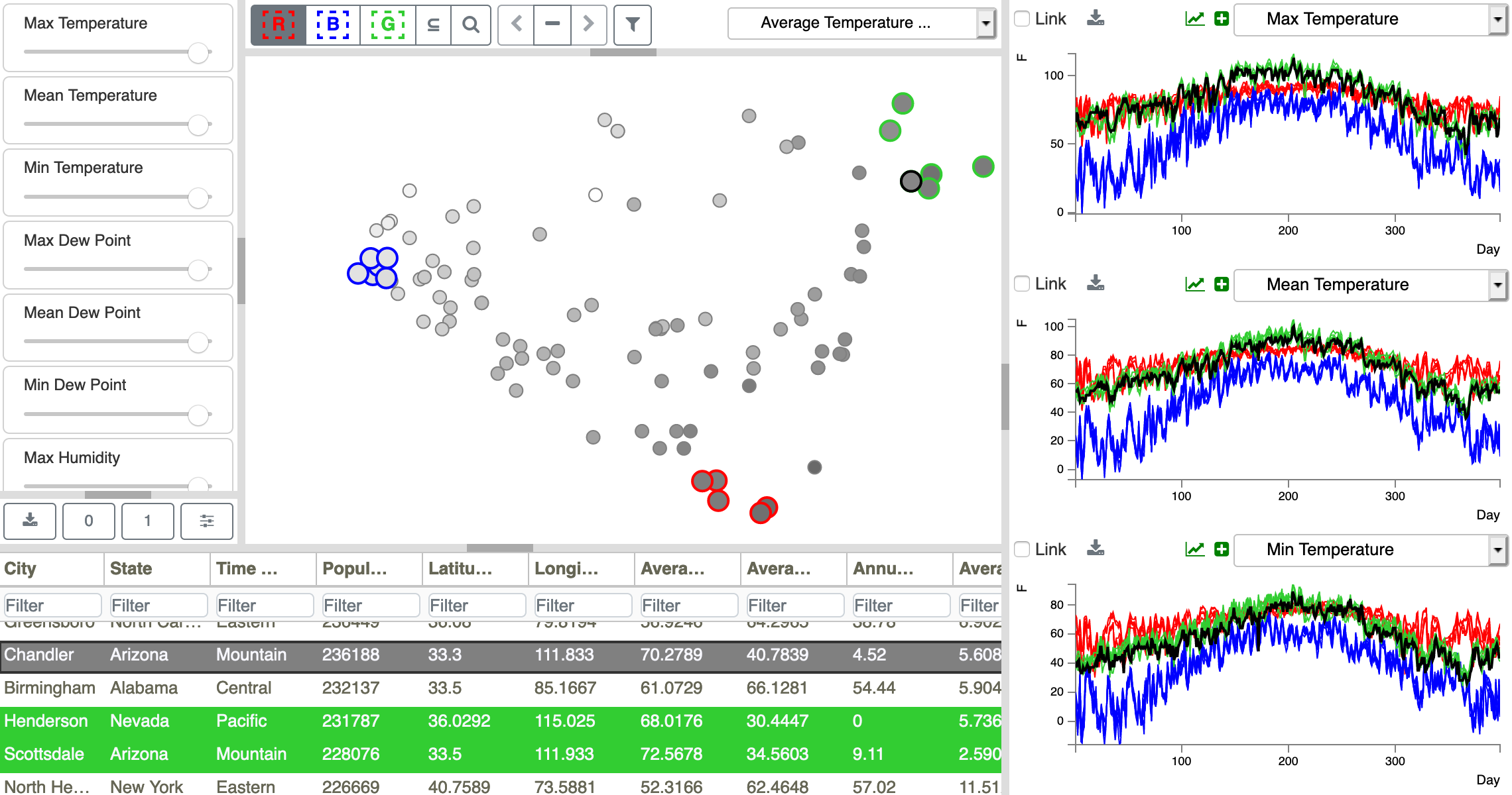
Figure 27: Selection of the city of Chandler from within the green set is highlighted using a bolded black point outline in the Scatterplot, black lines in the Time Series Plots, and black background for the Metadata Table row.
Focus selection works in all of the Scatterplot, Metadata Table, and Time Series Plot panes. In other words, you can select either a red, green, or blue selected point in the Scatterplot; a red, green, or blue selected row in the Metadata Table; or a red, green, or blue line in the Time Series Plot. In each case, the corresponding point, table row, or plot will be highlighted in black. (See also Plot Focus Selection and Table Row Selection.)